How to customize widget styles by adding CSS to your theme
While basic styling can be configured through the “Embed App” settings, more advanced customization is possible by adding CSS. This article explains how to apply custom styles to your widget by adding CSS to your theme.
Adding CSS to your theme
Using custom CSS
Custom CSS allows you to apply styles without editing Liquid files, making it easier to achieve your desired design not just for gift options, but across your store.
You can set up custom CSS through the Shopify theme editor. For detailed information, please refer to the Shopify documentation. Here, we’ll focus on key points for applying styles to our widget.
You can add custom CSS to your entire theme, or to a specific section of a template within your theme.
Shopify Help Center | Custom CSS
You can use either theme-wide or section-specific custom CSS. Choose whichever is easier for you to manage.
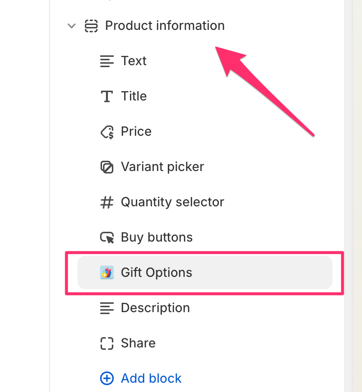
To add CSS to a specific section, click on the section containing the gift options (in this case, the product information section).
Scroll down to find the custom CSS field, where you can add your styles.
Editing theme code
The method for editing theme code varies depending on your theme. As the approach needs to align with how you manage your theme, we won’t provide detailed instructions here. If you need theme-specific editing support, please contact us.
If you have a large amount of CSS or want to reuse your CSS, editing the theme code directly might be a better option. Detailed explanations can be found in the Shopify documentation.
Applying styles to the widget
Let’s look at specific CSS snippets you can add to change different parts of the widget. We’ve prepared snippets for
various elements – simply copy and use the ones that match the elements you want to modify.
Apply CSS to checkboxes:
div[data-dw-widget="gift-options"] label.dw-checkbox {
    /* Add your checkbox styles here */
}
Apply CSS to product images:
div[data-dw-widget=gift-options] img.option-image {
    /* Add your product image styles here */
}
Apply CSS to select boxes:
div[data-dw-widget="gift-options"] div.dw-select > select {
    /* Add your select box styles here */
}
Apply CSS to the sender name field (input element):
div[data-dw-widget=gift-options] input.dw-input {
    /* Add your input element styles here */
}
Apply CSS to the message field (textarea):
div[data-dw-widget=gift-options] textarea.dw-textarea {
    /* Add your textarea styles here */
}
Examples
Widening the select element
div[data-dw-widget="gift-options"] div.dw-select {
  max-width: 300px
}
If you want to make the select box wider than the standard width, apply max-width to the select element.
Changing to vertical layout
div[data-dw-widget="gift-options"] div.dw-columns {
  flex-direction: column;
}
Applying this CSS will fix the layout to a vertical orientation.
By default, the widget layout is horizontal and switches to a vertical layout when the screen width narrows, such as on smartphone displays. However, if there are width restrictions due to display space considerations, it’s possible to change the layout by applying this style.
Conclusion
We have explained how to customize the appearance of widgets using CSS. We often receive requests from users who want to modify the design of specific parts of the widget.
Shopify themes are frequently updated, and many specifications are left to theme developers. This can make it challenging for app developers to support a wide range of themes.
However, our app is designed to blend seamlessly with themes using standard styles. It automatically retrieves and applies parameters such as border thickness and background color from the theme, ensuring a natural display. Additionally, the app maintains a high level of customizability by allowing detailed design adjustments through CSS.
In this article, we have explained these customization methods. We hope this information will be helpful when applying the optimal design for your shop.
Related articles
-
 Multilingual support settings guide
 -
Details of common widget settings
-
How to customize themes using option information [Order confirmation email]
-
Pricing plan details
-
How to implement the app using app blocks
-
App feature overview
-
How to implement the app using snippets
-
Widget page settings and product configuration